The Dashboard
Warehouse Optimization for Databricks is currently in preview. Reach out to Keebo support for access and onboarding.
How Is the Dashboard Navigated?
The Warehouse Optimization dashboard shows an overview of SQL warehouse workloads and DBU savings. It is the first page displayed when entering the Keebo portal. Navigate to it from anywhere in the portal by clicking "Overview."
What Does the Dashboard Layout Include?
The dashboard provides visibility into how Warehouse Optimization is performing. Filters allow customization by time period, workspace, and warehouse.
Databricks Spend
The dashboard compares daily, weekly, and monthly Databricks DBU usage with and without Warehouse Optimization.
Savings
The dashboard displays an estimate of how many DBUs Warehouse Optimization is saving over time. A detailed breakdown of how savings are calculated is included.
Filters and Customization
A variety of filters customize the dashboard view. Performance can be analyzed across different time periods and groups of warehouses.
What Are the Key Dashboard Sections?
Each section contains metrics and charts for the date range selected in the top left corner.
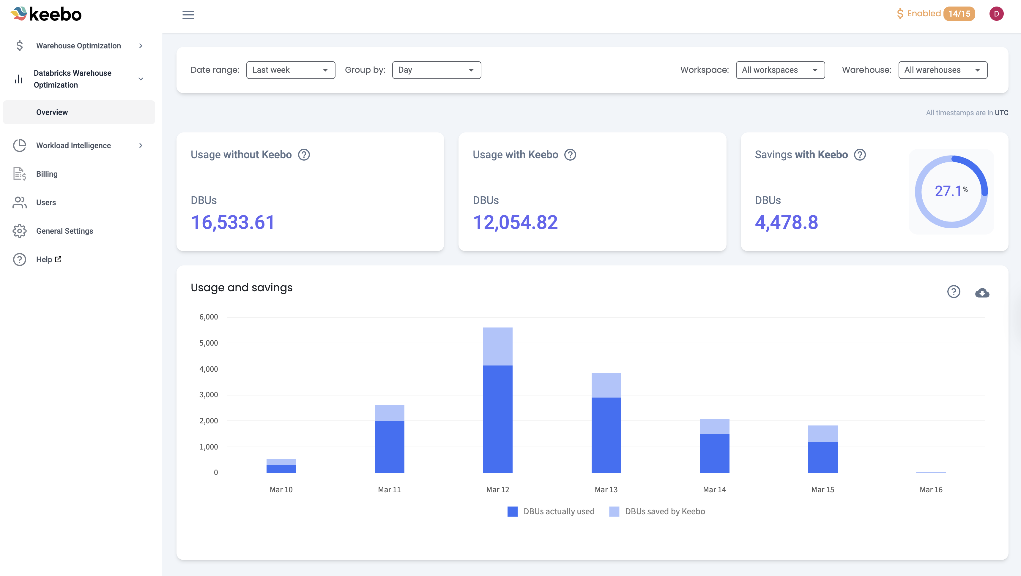
Key Metrics
The first section shows three key metrics:
- Usage Without Keebo — An estimate of how many DBUs would have been used if Warehouse Optimization was not enabled.
- Usage With Keebo — The actual DBU usage of warehouses connected to Warehouse Optimization.
- Savings With Keebo — An estimation of how many DBUs Warehouse Optimization saved, along with the savings percentage. The savings percentage is based only on warehouses that have Warehouse Optimization enabled.
Usage and Savings Chart
This chart compares the amount of DBUs actually used to estimated DBU savings with Warehouse Optimization. Hovering over a bar shows used and saved DBUs. "DBUs actually used" represents the actual compute consumed, while "DBUs saved by Keebo" shows the reduction achieved through optimizations. Clicking "Savings calculations" opens a detailed explanation of how savings are calculated.
How Is Overall Performance Analyzed?
The dashboard monitors the overall performance of Warehouse Optimization. As savings accumulate, the dashboard tracks progress. When configuration changes are made, the dashboard reflects how those changes affect performance.
Interpreting Key Performance Indicators
Savings — "Savings with Keebo" and the "Usage and savings" chart show how many DBUs Warehouse Optimization is saving. The amount saved depends on many factors. Warehouse Optimization generally saves more on warehouses with variable workloads, such as complex long-running queries at certain times of day and lighter loads at others. Warehouse Optimization predicts these changes and optimizes warehouses accordingly. Enabling optimizations for as many warehouses as possible maximizes savings.
How Is the Dashboard Filtered and Customized?
Several filters customize the dashboard view:
- Date Range — Charts show "Last week" by default. Any date range within the past two years can be selected, along with presets: Last Month, Last 3 Months, Last Year, and Year to Date.
- Group By — Charts are grouped by "Daily" by default. They can also be grouped by "Weekly" or "Monthly."
- Workspace — Select which Databricks workspaces appear in the charts. All connected workspaces are selected by default.
- Warehouses — Select which SQL warehouses appear in the charts. All connected warehouses are selected by default.